
I’m struggling getting the best use out of contrast yellow. Sometimes it looks great, but here I think it looks dark and unsaturated (is that the right word?)
I don’t have an epic ork army, I just painted this one because it was there. I am not that happy with the outcome. Maybe it’s time to sell up the epic stuff!

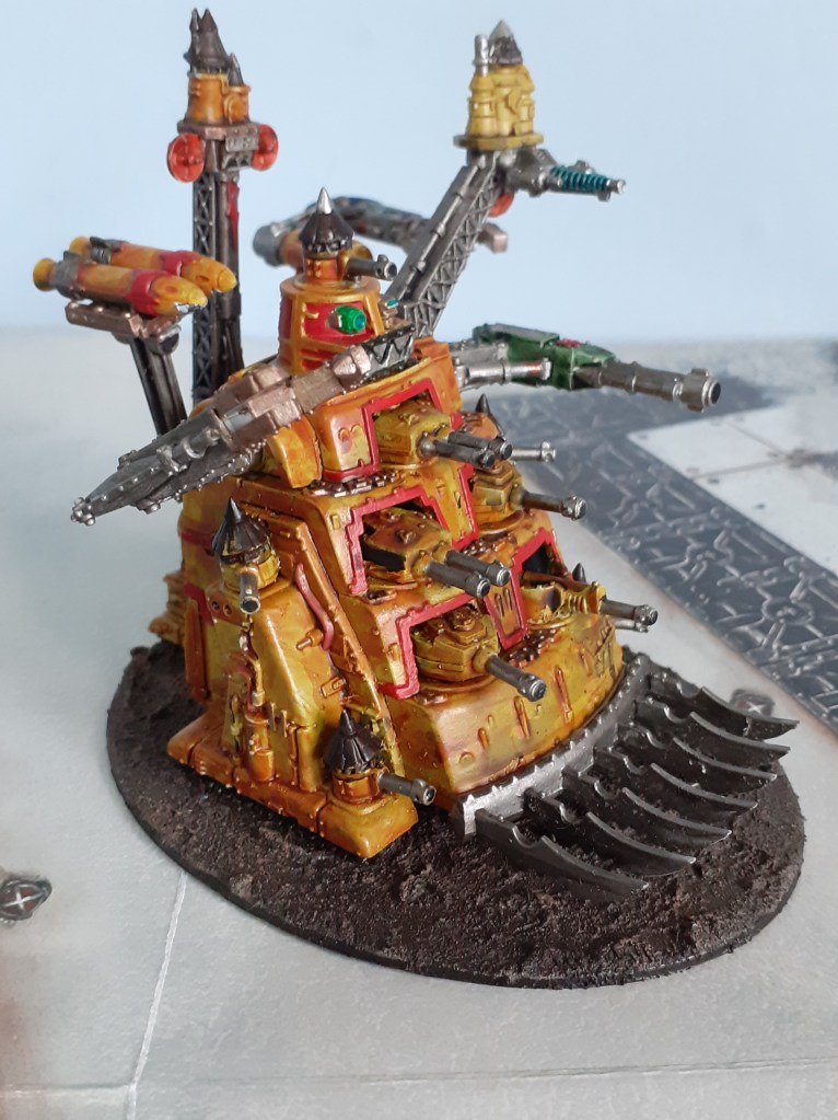

Looks alright to me mate – maybe a very light drybrush of a brighter shade of yellow to make it pop?
LikeLiked by 3 people
thats a good idea 🙂
LikeLiked by 3 people
I really like it! 🙂
LikeLiked by 2 people
I think the unsaturated look works well for this one mate 👍🏼👍🏼
LikeLiked by 2 people
I prefer this to the eyeblinding Technicolor of the period, personally. It’s a goofy old piece that can stand being brought down to earth a bit.
LikeLike